
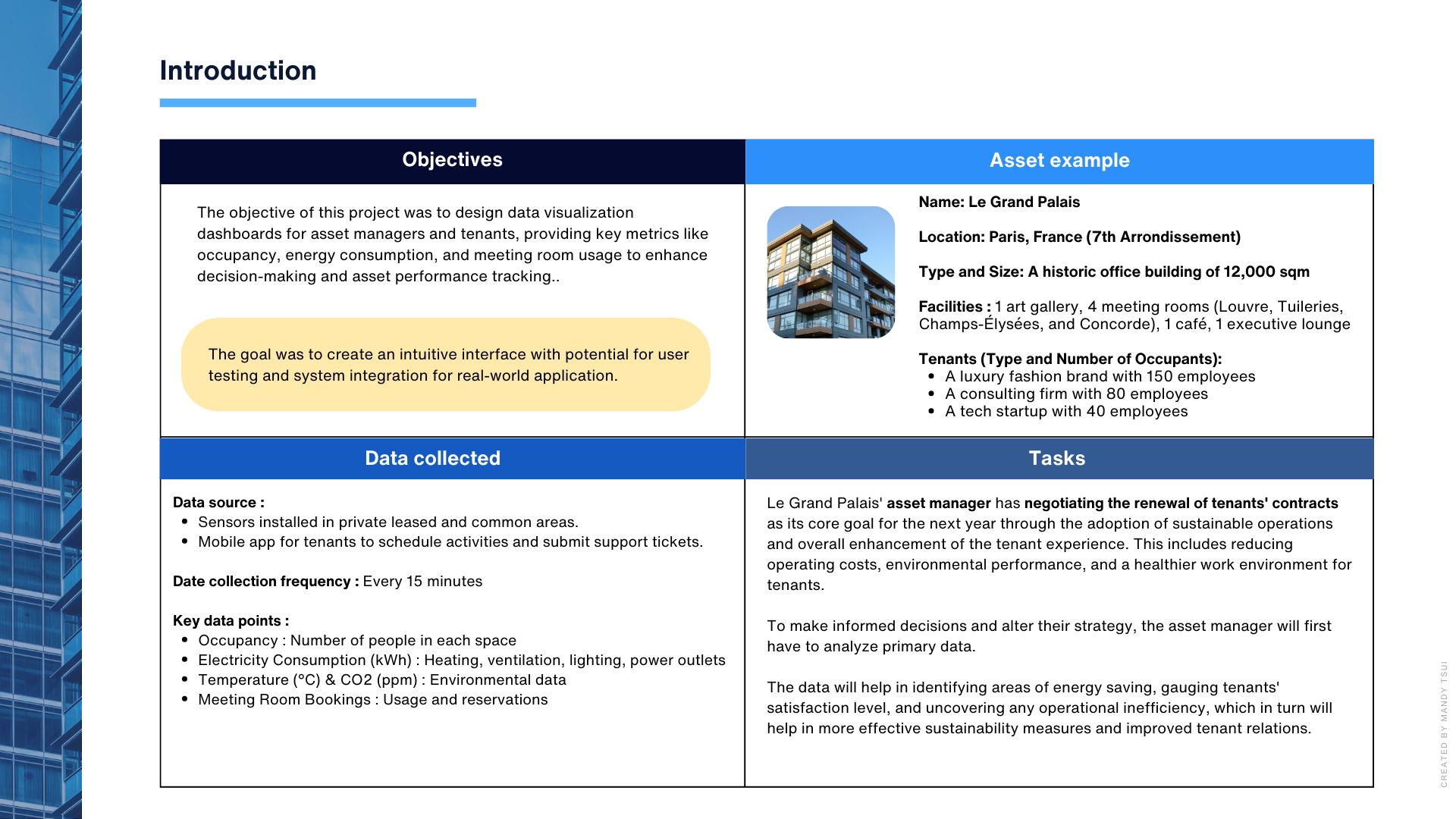
In the first part of the case study, the discovery phase was key to designing a solution that truly fit asset managers’ needs.
To put myself in their shoes, I created a fictional asset called Le Grand Palais, an antique office building in Paris. This helped me simulate real challenges asset managers face, like tenant retention and leasing.
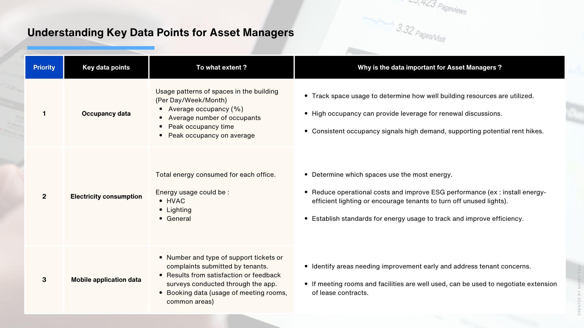
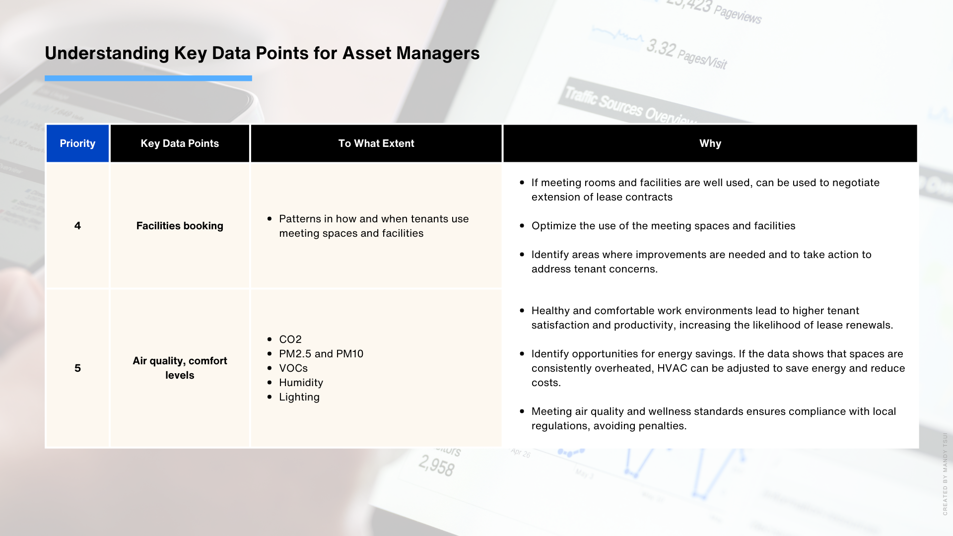
I identified and ranked the most important metrics they would need, such as occupancy rates, energy consumption, and tenant sentiment. Then, I explored how these insights could be used for contract negotiations, improving operations, and cutting costs.
To map out the layout and interface flow, I started with hand-drawn wireframes. Sketching on paper helped me quickly test multiple ideas and refine the layout before committing to digital designs. I made sure to highlight key metrics like occupancy and energy usage in a clear, readable way. Keeping the dashboard clean and minimalist was a priority, so asset managers could easily scan the data and take action without feeling overwhelmed.
Once the wireframes were solid, I translated them into digital mockups, balancing functionality with aesthetics. I focused on intuitive navigation and consistent design elements to enhance the user experience.
The dashboard gave asset managers real-time snapshots of key metrics like occupancy, energy consumption, and meeting room usage. This made it easy to monitor building performance at a glance. The clean, user-friendly design kept navigation simple, allowing them to explore data effortlessly and make informed decisions on tenant retention, energy efficiency, and cost savings.
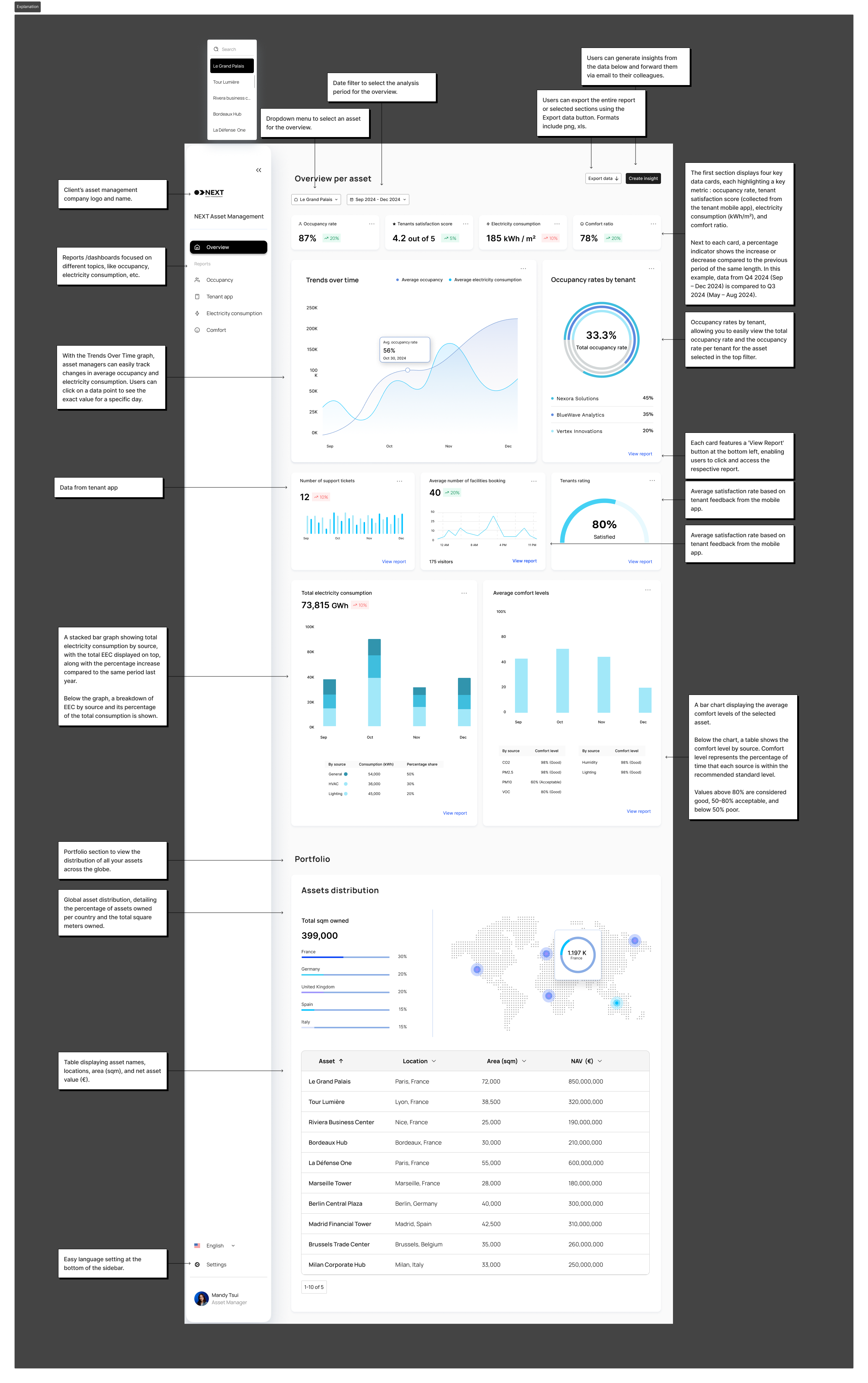
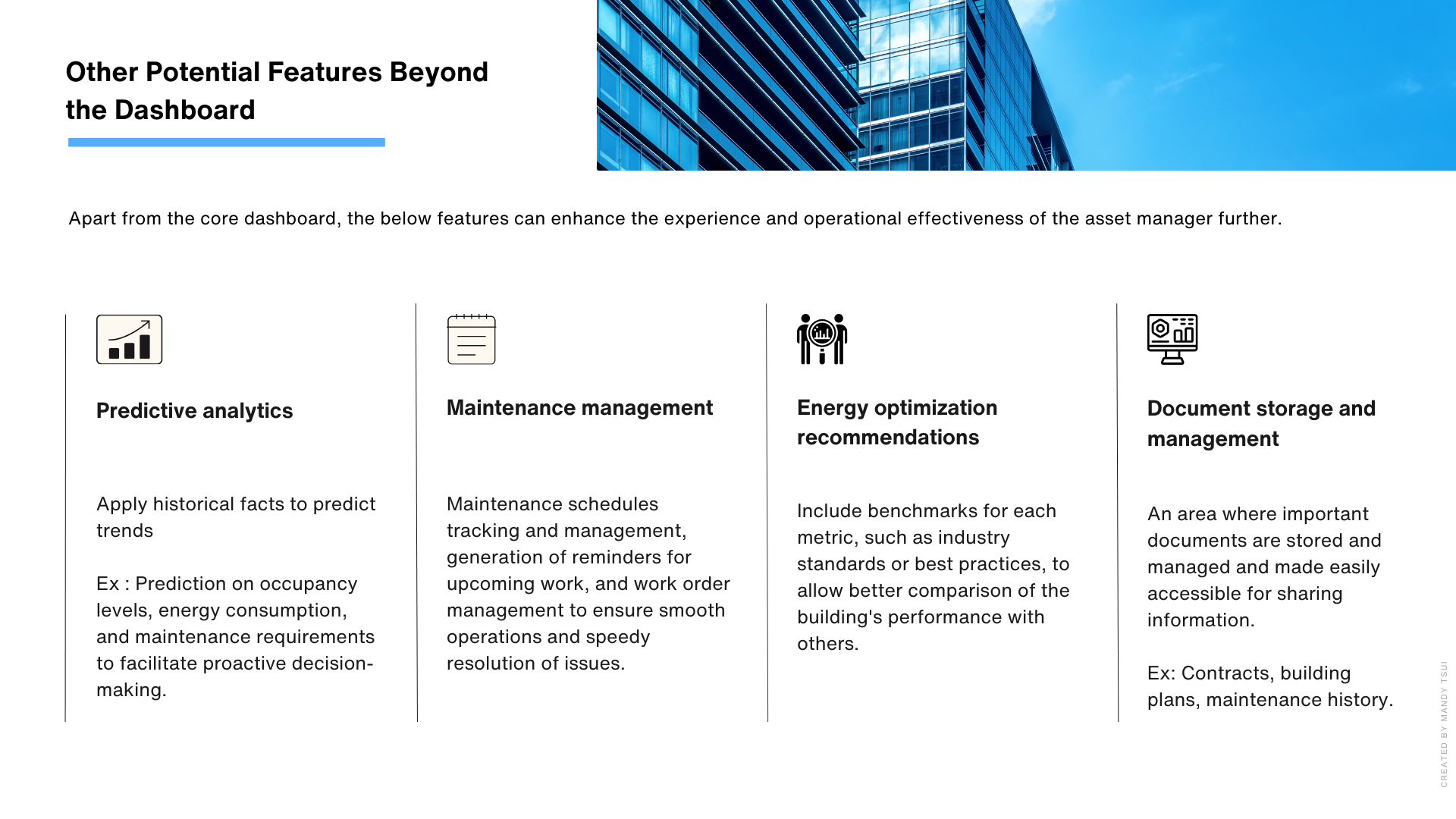
I also identified and listed potential additional features that could further enhance its functionality.
After creating the asset manager dashboard, I explored the possibility of creating a similar solution for tenants. Tenants are interested in having more information related to energy usage, space utilization, and access to building resources. A single-purpose dashboard could provide them with insights that can influence their experience and engagement with the building.
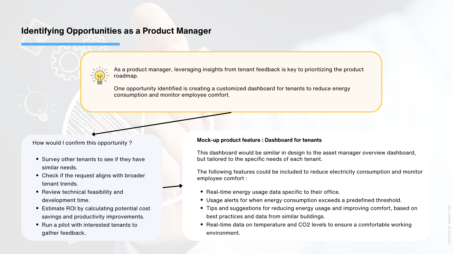
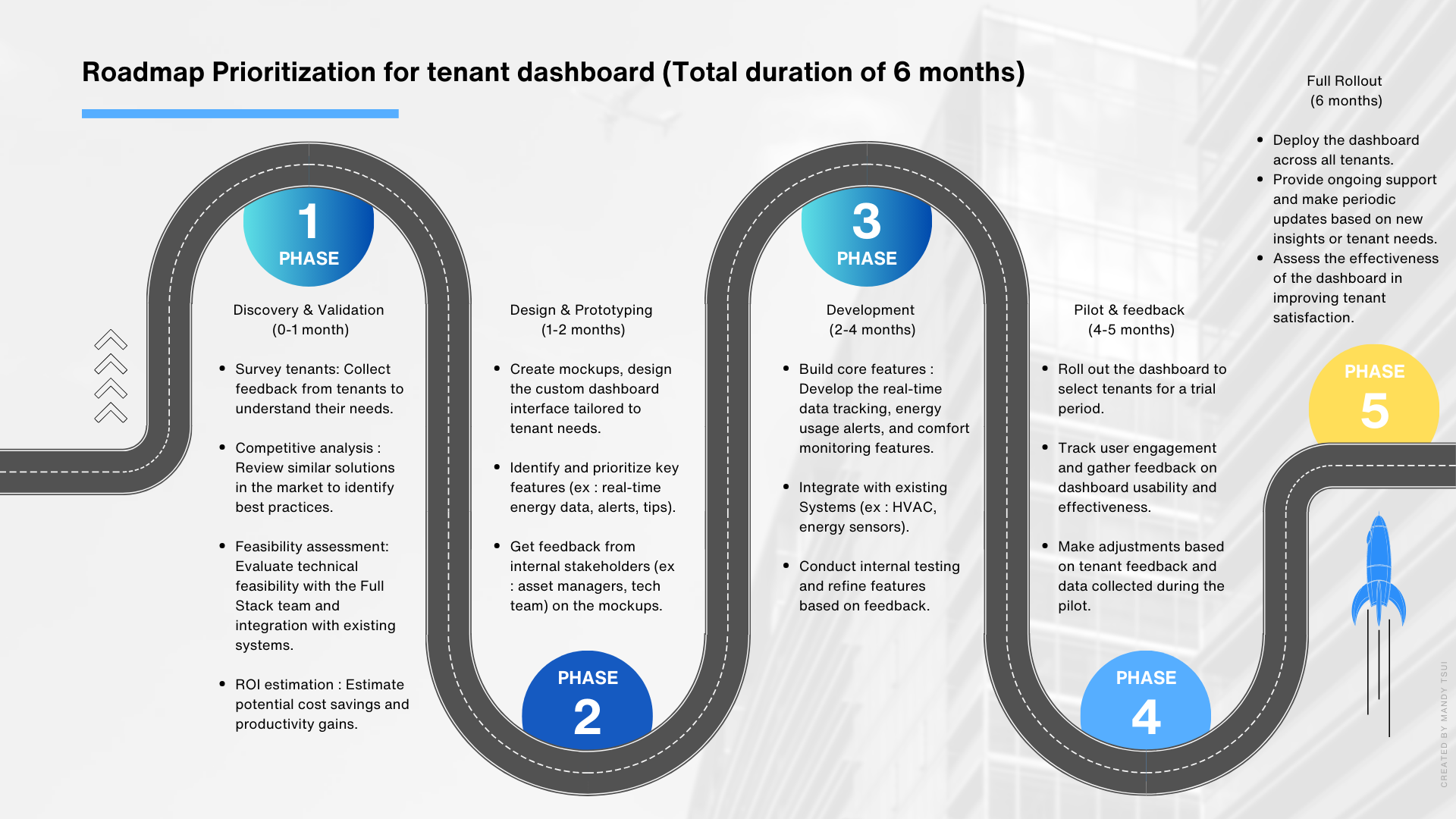
To develop the tenant dashboard, I mapped out a clear plan. First, I would start with research, by talking to tenants through surveys and interviews to understand their biggest pain points. Then, I would validate the concept by defining key features and testing assumptions. Once that’s solid, I would create prototypes for early user testing, making iterations based on feedback before moving into full development. Finally, the rollout would be phased, starting with a pilot before expanding to more users.
